Small garden colour palette - Sarah Raven explains how to plant for your petite plot
The ins and outs of choosing a small garden colour palette with help from Ideal Home's garden expert Sarah Raven
- (opens in new tab)
- (opens in new tab)
- (opens in new tab)
- Sign up to our newsletter
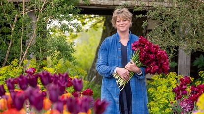

If you get your garden colour right, with a palette you love, you’ll be revelling in it every day, but equally, it will hit you and all your visitors in the face when it’s wrong. And there’s nowhere that this is truer than in a small garden space.
I’ve got five ways I think colour works in a garden. The first is the simplest and it’s sticking with monochrome. The next four are all mixing colours in quite strictly segregated groups, each giving the garden a different feel.
Is it velvety and enveloping you want (rich)?
Or stand-away crisp and smart (cool)?
A place to be calm in, with the soft, gentle, what I call cashmere jersey colours (warm)?
Or somewhere to excite you, designed to stimulate and pull you out there to have a look (brilliant)?
I love all four - and they suit different sites and situations - but most of all, to guarantee success with colour, I’ve found it’s good to stick to some rules.
Small garden colour palette - Sarah Raven's top 5 mixes for compact spaces
1. Monochromes

When designing a spring garden refit, or a seasonal boost, monochrome is a safe, successful option to go for - just one colour in all its tones, filling the view.
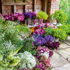
We had lovely colour corners here at our garden in Perch Hill (opens in new tab) last summer with a purple combination, surrounded on all sides by rosemary, the brightness of the purples balanced by the silvery-green.
We also had a rich saturated swathe of three pots, all with matching crimson velvet flowers. Then a sweep of white and pale flowered plants for both spring and summer on a north-facing wall.
Bear in mind, green doesn’t really count as a garden colour. We are sort of blind to it, almost indifferent, like the white of a page. It’s not always true, but you can assume the darker greens are largely neutral, a background colour, so, into green you’re adding just one colour.
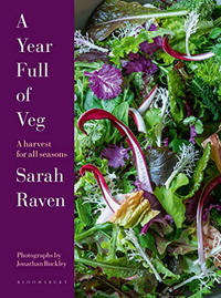
A Year Full of Veg: A Harvest for All Seasons by Sarah Raven | £21 at Amazon (opens in new tab)
Discover all the inside tips and tricks on how to grow your own, from garden to table, all broken down into monthly tasks and do do lists to make the journey a whole lot easier.
Knowing where you put each colour is key. I find the brights — oranges, brilliant pinks or purples, can go anywhere as long as they’re on their own (or in careful mixes – see below).
It’s different for the dark colours and the very pales. You need to be more selective with where you put these. Our crimson flowers were positioned to stand out from a sea of bright green amelanchier leaves and I’m convinced a well-lit spot is the best place to use these rich colours.
If the flowers are dark, they become invisible as the light gets low and then create a black hole. With the acidity of the amelanchier green as our backdrop, it highlighted almost every petal of the crimson flowers and you really saw them.
Whites on their own can work anywhere, but they’re super-useful in the darker parts of the garden — on the north-side of the house or tucked in on the shady side of a wall.
That’s where we have our ivory, white, cream and pale-yellow plants, shining light into what can be gloomy. You can have the lightest scattering of another colour (such as purple or blue) but the overall effect needs to be white.
Whether in spring with tulips (such as ‘Exotic Emperor’ and ‘Purissima’) or daffodils (such as ‘Thalia’ and ‘Silver Chimes’) or in summer and autumn with compact cosmos, (‘Sonata White’), foxgloves and tobacco flowers (‘Only the Lonely’ and N. grandiflora), we use white or very pale-coloured flowers in all our dappled shade.
2. Colour combinations
If you want more of a combination of colour, knowing when enough is enough is key. I have four mixed palettes which I know work and sticking within these always delivers.
You may know straight away which palette you prefer, but if not, having colour swatches from a paint shop is useful.
I also find coloured candles excellent and they give you flower-like density of colour, more like the end result than small paper swatches. Then, with the palette guidance below, have a play.
Palette 1 - Dark and rich colours

This palette is my original love, a rich family of colours - conker-brown, almost black, copper, vermilion (or red orange), olive-green, emerald, deep purple, indigo and most of all crimson. They suck up the light - I think of them as the velvet colours you want to wrap yourself in.
These all look wonderful together but need a sunny situation and benefit from a splash of one colour from the next palette sprinkled through.
If I’m using lots of plants with flowers and leaves of mahogany and crimson, I’ll borrow gold, orange or lime from the next group as a light dusting, but all-importantly, totalling not more than a third of the flower colour.
This is like a squeeze of lemon over smoked salmon, the citrus sharpener lifting the richness and making it look all the richer and more beautiful and preventing this dark palette from ever being sombre.
Palette 2 - Brilliant colours

Next comes the brilliant colours — blackcurrant, raspberry, strawberry, orange, lemon, lime and cobalt-blue. These tend to be translucent, like stained glass.
They are joyful and light on their feet, but we need to take care not to get carried away. This palette can descend quickly into a primary school classroom jamboree.
To avoid too much razzamatazz, select just a couple of colours and stick to that pair, the second colour as a sprinkling, just like above, filling not more than a third the overall view, in there again for contrast.
We often have a mass of orange flowers here, with a smattering of blackcurrant, and orange is also great with cobalt. That works well, as does raspberry or fuchsia with lime.
Going outside the palette, mahogany, bronze and crimson from rich are good for a dash of sobriety in brilliant, calming down particularly the zingy citrus colours in a good way.
There’s no (or very little) white mixed with the colours in the first two palettes, but plenty in the remaining pair. Many of the same colours in rich and brilliant are the basis here, but the white softens the intensity in the second two palettes and turns them pastel.
Palette 3 - Soft and warm colours

The first lot with white in is what I call warms, where orange, brown, gold and crimson have had plenty of white added.
This results in peach, milky coffee, ivory, apricot, (with more yellow in it than peach), faded coral and muted, smoky pink. This palette is fashionable at the moment, vintage, with a 1970’s air. It’s easy and comforting to use.
In terms of mixing, the colours are earthy and organic, and don’t look good with the super-clear and clean brilliants or cools. But they are lovely with crimson, bronze or copper, also earthy, which add depth and cut through what can be a cloying sweetness in the warms.
Palette 4 - Soft and cool colours

Finally, there’s the cool lot, where purple, blue, blue-green and yellow are mixed with a graduating scale of white. From mauves, soft blues, blue-pinks, primrose and white, going all the way to its purest bright-white form.
This is the trickiest palette to mix successfully with others. This lot really are best kept on their own.

Sarah Raven is a gardener, teacher and writer who runs her own online plant nursery specialising in colourful, productive cut flower seeds and seedlings, edible crops and a large range of perennials, shrubs and roses (as well as the kit to grow them).
Over the last three decades, she has written regularly for the Financial Times, The Telegraph, and many other publications including Ideal Home.
Sarah presented on BBC Gardener’s World, including several one-hour specials (e.g., Bees, Butterflies and Blooms).
She has an online course with Create Academy on growing cut flowers launching in autumn 2023 and has her own successful podcast Grow, Cook, Eat, Arrange.
Her garden - Perch Hill Farm in East Sussex - is open 20 days a year.
-
 You wouldn't know this chic bedroom wall panelling makeover cost less than £100
Take your room from bland to grand with this simple cost-saving DIY project
By Laurie Davidson
-
 Growing a cut flower patch - Sarah Raven explains how to plant for fresh flowers
Ideal Home's garden expert Sarah Raven reveals how to grow a cut flower patch to ensure your vases are always brimming with blooms
By Sarah Raven
-
 'I just needed to have a black house' - This former pebble-dash house has been completely transformed
See how upgrading the look of your home can totally transform it – and it's easier than you think
By Laurie Davidson
